Copper Moon Branding
Rational
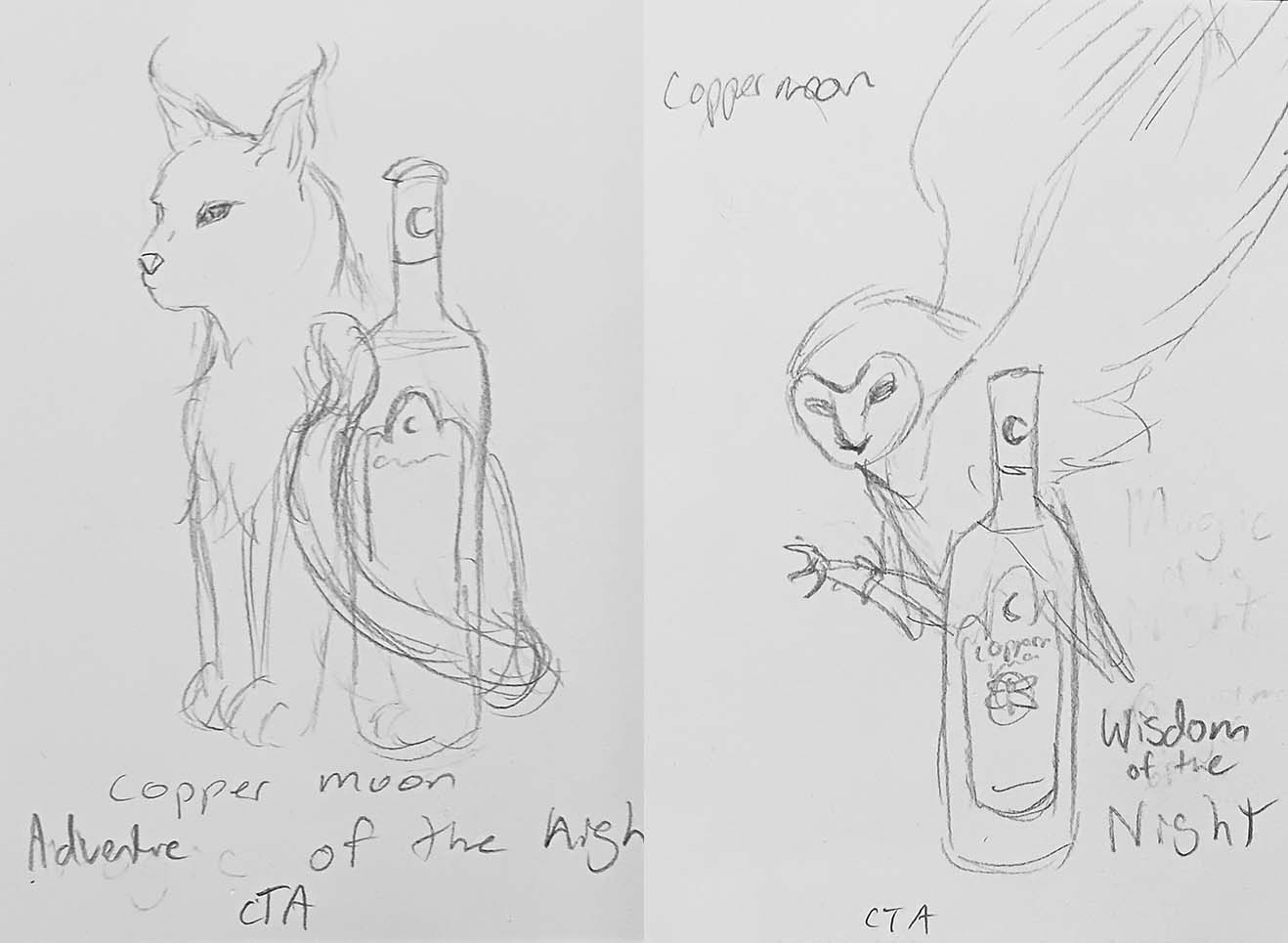
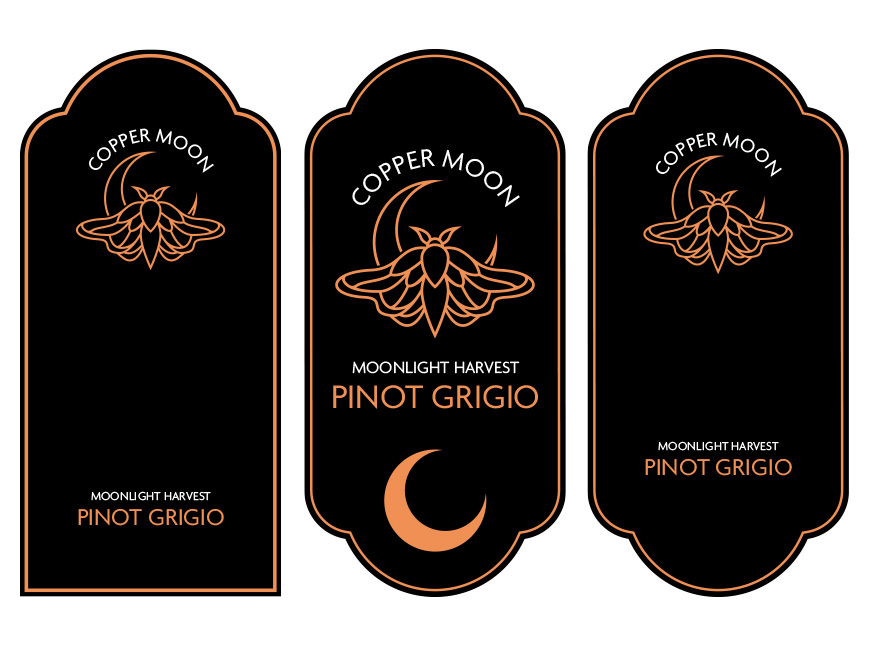
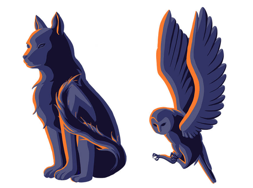
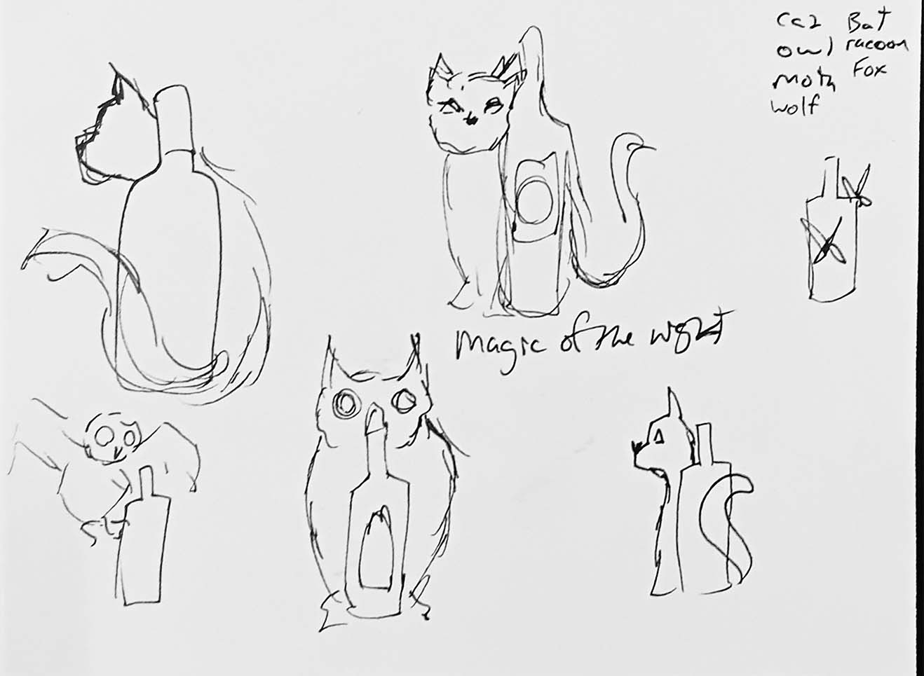
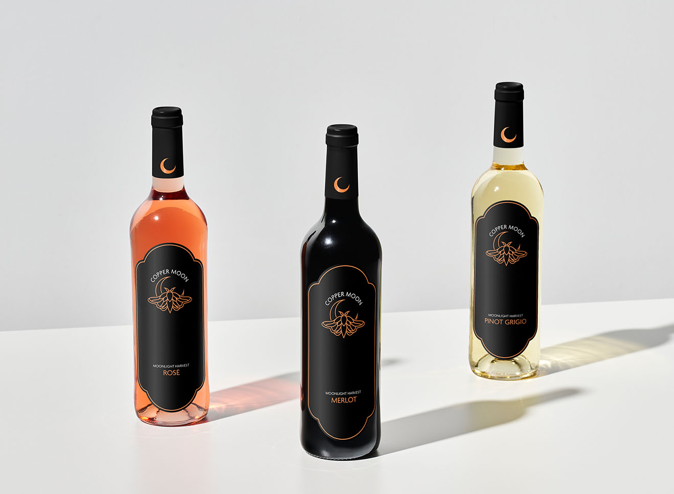
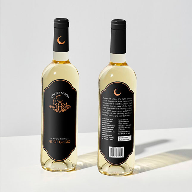
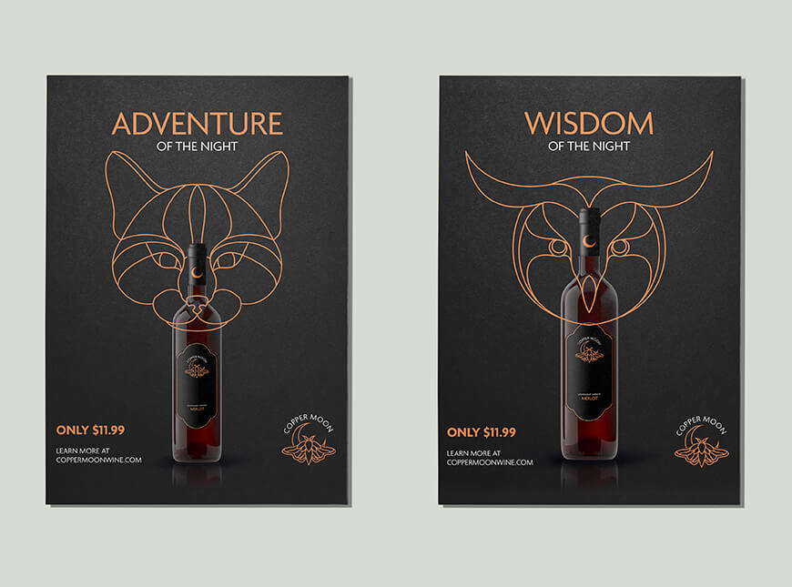
The Copper Moon rebrand aims to elevate the brand's aesthetic while keeping it identifiable. The redesign takes inspiration from the word “moon”, and uses many night elements as a motif. The campaign uses animals typically associated with the night, along with words associated with the animal to push the desired brand theme. The stylization of the campaign is based on the style of the new logo but uses more detail to add more interest to the campaign.
- Packaging Design
- Branding
- Logo Design
Process